When you stare at a futures chart for the first time, it can look like a jumble of random, jagged lines. But it's not noise. It's a story—a second-by-second account of the battle between buyers and sellers. Learning to read that story is the first, most critical step to making sense of market direction. Since 2014, Trading Made Easy has been dedicated to this mission: simplifying the complexities of trading and empowering individuals with tools that provide clarity and confidence.
Your Foundation for Reading Futures Charts
Here at Trading Made Easy, we've been helping traders cut through the noise and find clarity in the markets since 2014. Our goal has always been to make complex topics simple. Before we get into the fancy indicators or automated strategies, we need to go back to basics. You have to learn the alphabet before you can write a novel, right?
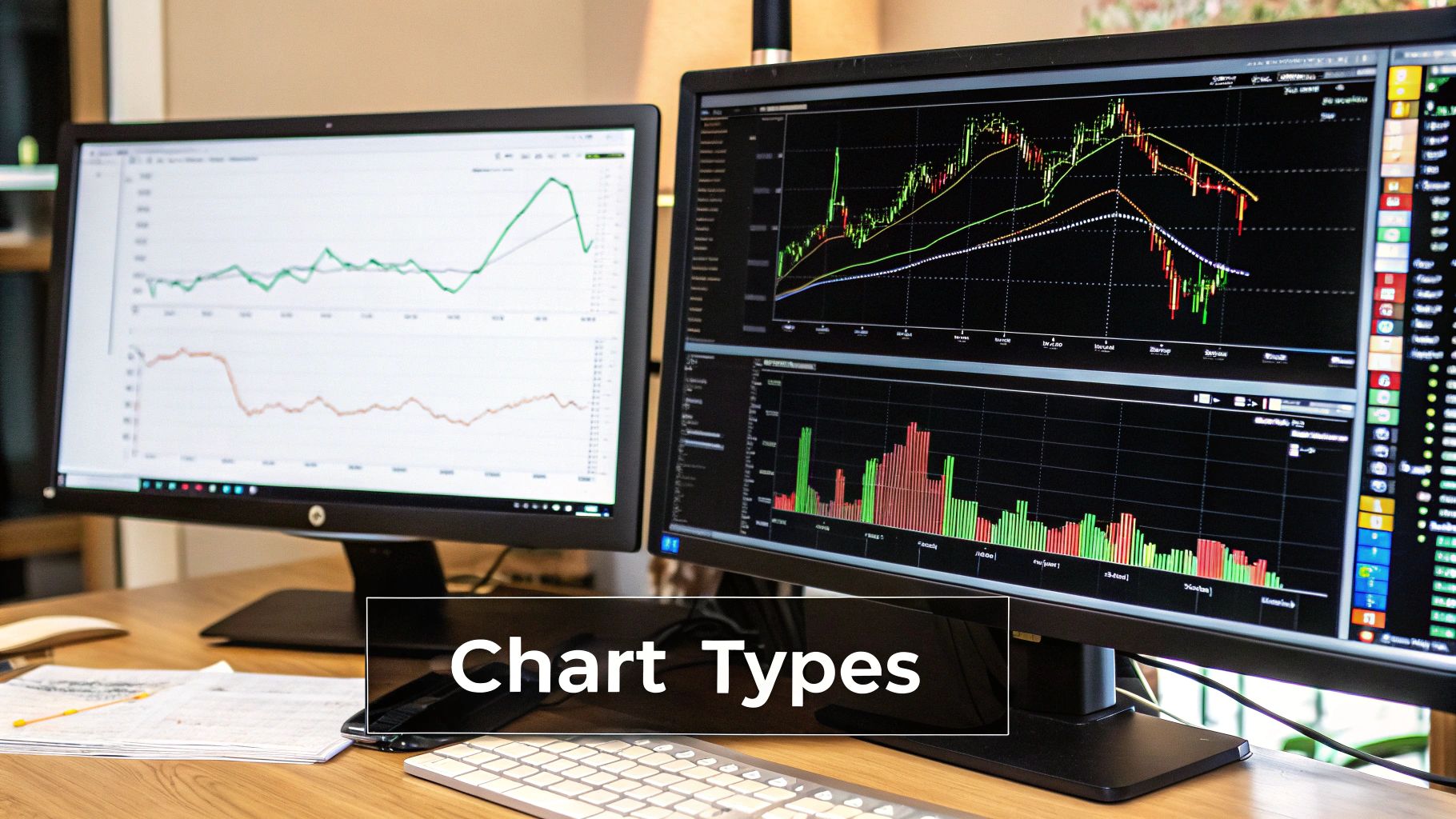
Your journey starts with the three chart types you'll see on almost any trading platform: line, bar, and candlestick charts. A line chart is too simple—it just connects the closing prices. The real meat is in bar and candlestick charts, because they give you a much richer picture of what happened.
The Four Pillars of Price Action
Every single bar or candle on your chart, regardless of the timeframe, is built from four crucial pieces of information. You’ll often hear this called OHLC data. Getting this down cold is non-negotiable.
- Open: Where the price started for that period.
- High: The absolute highest point the price touched.
- Low: The absolute lowest point the price touched.
- Close: The price where things ended for the period.
The distance and relationship between these four points are what give a candle its shape and color. This gives you an immediate visual cue about who's in control. See a long green candle where the close is way above the open? That’s pure buying pressure. A long red candle tells you sellers took charge and pushed the price down hard.
A chart is more than just data; it's a visual record of human psychology—fear, greed, and indecision playing out in real time. Your job is to learn to read that psychology.
To give you an idea of the scale we're talking about, the U.S. futures market is a whirlwind of activity. The Cboe reports an average of 195,400 daily contracts traded. Each candle on your chart is a summary of all that action in a given timeframe, whether it's one minute or one day.
This is where the details matter. A candlestick with a long wick (or shadow) sticking out the top tells you that buyers tried to push the price up, but sellers came in and slapped it back down. That's a powerful clue that could signal a reversal. This is why successful traders don't just look at price; they combine it with other data like volume to get the full story.
Let's break down the most essential chart elements into a quick-reference table.
Key Chart Elements and Their Meanings
This table is your cheat sheet. Use it to quickly decipher the core components you'll find on any futures chart.
| Element | What It Shows | Why It Matters for Traders |
|---|---|---|
| Candle Body | The range between the open and close price. | A long body shows strong conviction (either buying or selling). A short body suggests indecision. |
| Candle Color | Whether the close was higher (e.g., green) or lower (e.g., red) than the open. | Instantly tells you if buyers or sellers won the battle for that period. |
| Wicks/Shadows | The price extremes (high and low) outside of the open and close. | Long wicks show that the price was rejected at a certain level, often signaling a potential reversal. |
| Timeframe | The duration each candle or bar represents (e.g., 5-minute, 1-hour, 1-day). | Changes the "zoom level" of your analysis. Shorter timeframes show noise; longer timeframes show the trend. |
| Volume | The number of contracts traded during the period. | High volume confirms the strength of a price move. Low volume suggests a lack of conviction. |
Think of these elements as the basic vocabulary of the market. Once you know them, you can start forming sentences.
Ultimately, mastering OHLC is the bedrock of all technical analysis. Every pattern, indicator, and strategy you'll ever learn is built on this fundamental understanding of price action. Once you can glance at a single candle and instantly know its story, you're ready to start stringing them together to read the market's plot.
Unlocking Price Action with Candlestick Patterns
While a single candle gives you a snapshot, stringing them together is where you start to understand the market's real language. Price action is the raw dialogue between buyers and sellers, and candlestick patterns are your key to interpreting that conversation. When you move past individual OHLC data, you start to see stories unfold and get a feel for where momentum might be headed next.
These aren't just random shapes on a screen; they’re visual clues into market psychology. Learning to spot them on your futures charts is a game-changer. Soon enough, you'll see them everywhere, whether you're trading the fast-moving E-mini S&P 500 or the notoriously volatile Crude Oil markets.
Reading Reversal Signals
Reversal patterns are some of the most powerful signals a trader can ask for. Why? Because they can flag the end of one trend and the very beginning of a new one, showing you exactly when the balance of power is shifting between the bulls and the bears.
Imagine a Hammer pattern showing up after a long, grinding downtrend. It’s got a small body at the top and a long shadow, or wick, sticking out below. What's it telling you? It shows that sellers tried their best to push the price down, but buyers came roaring back with enough conviction to close the price right back up near its open. That forceful rejection of lower prices is a huge hint that the sellers are running out of steam.
Another classic is the Bullish Engulfing pattern. This is a two-candle signal where a big green candle completely swallows, or "engulfs," the body of the smaller red candle right before it. It’s a dramatic visual of buyers wrestling control away from sellers, often marking a market bottom.
The secret to using these patterns effectively is context. A reversal signal at a major support or resistance level carries way more weight than one that just pops up in the middle of a messy, sideways price swing.
Spotting Trend Continuation
Not every pattern screams "reversal!" Sometimes the market just needs to take a breather before continuing on its way. These are called continuation patterns, and they give you a fantastic opportunity to hop aboard an already established trend.
- Flags: These look like little rectangular channels that slope against the main trend. A bullish flag, for instance, forms after a sharp move up, drifting down slightly as traders consolidate before the next leg higher.
- Pennants: Very similar to flags, pennants are small consolidation zones that appear after a strong price move. The key difference is their shape—they look like small, symmetrical triangles with converging trendlines.
These patterns represent a brief pause where traders might be taking some profits or sizing up their next move. The breakout from a flag or pennant, especially if it happens with a spike in volume, is often your green light that the original trend is back in play. You can get a deeper dive into these formations in our guide on candlestick patterns for beginners.
The real skill isn't just memorizing dozens of patterns; it's about understanding the story each one tells. When you learn how to read futures charts this way, you can find much higher-probability trades and make smarter decisions, like placing your stop-loss just below the low of a bullish reversal pattern. It's about trading what you see, not what you hope for.
Gaining an Edge with Volume and Open Interest
https://www.youtube.com/embed/P7qikc4439g
If you think of price action as the what, then volume and open interest tell you the why. And, more importantly, they reveal the conviction behind the move. Honestly, trading on price alone is like watching a silent movie. You can see the action, sure, but you’re missing the dialogue that gives it all meaning. Adding these two data points gives you the context you desperately need to trade smarter, not harder.
The volume histogram, that little bar chart usually sitting at the bottom of your screen, is your most basic yet powerful confirmation tool. Every single bar shows you the total number of contracts that changed hands during that candle's timeframe. Think of it like a crowd meter. Is the crowd roaring with excitement, or is it just a few people whispering?
Interpreting Volume for Stronger Signals
Let's walk through a real-world scenario. You spot a bullish candlestick pattern, and the price starts punching through a key resistance level you've been watching. If this breakout happens on a massive spike in volume—way above the recent average—that’s the market screaming at you that this is a real move. That surge in participation shows that droves of traders are putting real money on the line to back the breakout.
Now, flip that around. What if the price just sort of drifts lazily above that same resistance level on weak, pathetic-looking volume? That should set off alarm bells in your head. It’s a huge red flag whispering “potential fakeout.” This lack of participation suggests there just isn't enough buying power to keep the move going, and the price could easily slam back down, trapping anyone who jumped in late.
Volume almost always precedes price. You'll often spot a surge in volume just before a big price move, giving you a heads-up that something is about to go down.
Getting a feel for reading volume alongside price action is how you build a much deeper, more robust understanding of what the market is actually doing. This skill is absolutely fundamental for learning how to identify market trends that have genuine momentum.
Demystifying Open Interest
While volume measures the intensity of trading activity, open interest (OI) gives you another critical piece of the puzzle. Open interest is a metric you'll only find in futures and options, and it represents the total number of contracts that are still open and haven't been settled. In simple terms, it tells you whether new money is flowing into the market or getting pulled out.
Here’s a simple cheat sheet for combining OI with price and volume:
- Price Up + Volume Up + OI Up: This is the Holy Grail for bulls. It shows new money is flooding in, fueling a strong and healthy uptrend.
- Price Up + Volume Down + OI Down: A much weaker signal. The rally is likely just short-sellers covering their positions, not fresh buyers entering. The trend could be on its last legs.
- Price Down + Volume Up + OI Up: This is the strongest signal for the bears. It shows new money is coming into the market to actively short it, confirming a strong downtrend.
- Price Down + Volume Down + OI Down: This is a weak bearish signal. The drop is probably just nervous long-position holders getting out. The trend might be running out of gas.
When you start weaving together the threads of price, volume, and open interest, you're no longer just staring at lines on a screen. You're reading the market’s full story, which helps you sidestep common traps and place your trades with a whole lot more confidence.
Using Indicators to Sharpen Your Trading Signals
Let's be clear: technical indicators aren't a crystal ball. They won't magically predict every market move. But what they can do is bring a lot of clarity to the price action you're seeing on the screen, which is a massive edge for improving your trade timing. The Trading Made Easy platform leverages this by integrating our patented, AI-driven technology. It doesn't just display indicators; it interprets market data to identify high-probability setups, manage trades from entry to exit, and remove the emotional guesswork that derails so many traders.
The biggest mistake I see traders make is piling on too many indicators. This creates what we call "analysis paralysis." You get a dozen conflicting signals, and you freeze up. The goal is to keep your charts clean.
Instead of cluttering your view, pick just a few indicators that tell you different things. This approach gives you a much clearer, more complete picture of what the market is actually doing. We'll look at two of the most reliable types: trend-following indicators and oscillators.
Defining the Trend with Moving Averages
The Moving Average (MA) is probably one of the first indicators any trader learns, and for good reason. It’s a workhorse. By smoothing out price data over a certain period, it gives you a clean, single line that makes it far easier to see the underlying trend.
The rule of thumb is simple. Is the price staying above the moving average? The trend is likely up. Is it consistently below? The trend is probably down.
MAs also double as dynamic support and resistance. In a solid uptrend, it's common to see the price pull back to a moving average, find buyers, and then bounce higher. This gives you a clear potential zone to look for an entry and get in with the trend.
Trader's Tip: A classic setup involves using two moving averages—a short-term one (like a 10-period MA) and a longer-term one (like a 50-period MA). When the fast line crosses above the slow one, that's often seen as a bullish signal (a "golden cross"). When it crosses below, it's a bearish signal (a "death cross").
Timing Entries with Oscillators
Okay, so moving averages help you see the trend. But how do you time your entry? That's where oscillators come in. They are designed to measure momentum and help you spot potential exhaustion points in a move.
The Relative Strength Index (RSI) is a perfect example. It's a momentum indicator that moves between 0 and 100.
Most textbooks will tell you that a reading above 70 is "overbought" and a reading below 30 is "oversold." While that's a good starting point, the real power of the RSI comes from identifying divergence.
- Bullish Divergence: This happens when the price chart makes a new low, but the RSI makes a higher low. It's a clue that the downward momentum is fading, and the market could be getting ready to turn up.
- Bearish Divergence: The opposite scenario. The price pushes to a new high, but the RSI puts in a lower high. This is a warning that the buying pressure is running out of steam, and a move lower could be on the horizon.
Here at Trading Made Easy, we know that applying these concepts systematically can be tough in the heat of the moment. Our automated day trading software is engineered to interpret these exact types of signals with mechanical precision, executing trades based on a logical, programmed framework. It takes the emotion out of the equation and lets traders apply these time-tested ideas without being glued to their screens all day.
A Real-World Trade Walkthrough on a Futures Chart
Theory is great, but let's be honest—it's watching the pieces click together on a live chart where the real learning kicks in. I want to walk you through the anatomy of an actual trade, showing you exactly how I go from a chart that looks like pure chaos to a clear, actionable plan.
This is the kind of systematic process that drives successful trading, whether you’re clicking the buttons yourself or running an automated system. It’s all about building a solid case for a trade, one piece of evidence at a time. For example, a client named John, previously struggling with inconsistent results, started using our software. The system identified a textbook bullish divergence on the E-mini S&P 500, entered a long position with a pre-defined stop, and took profit at a key resistance level—all without him having to second-guess the setup. This disciplined execution turned what would have been an emotional trade for John into a calm, profitable one.
From Big Picture to Trade Setup
My analysis always starts on a higher timeframe, like a 60-minute or 4-hour chart. Before I even dream of placing a trade, I need to get the lay of the land. What’s the primary trend? Is the market pushing up, sliding down, or just chopping sideways in a range?
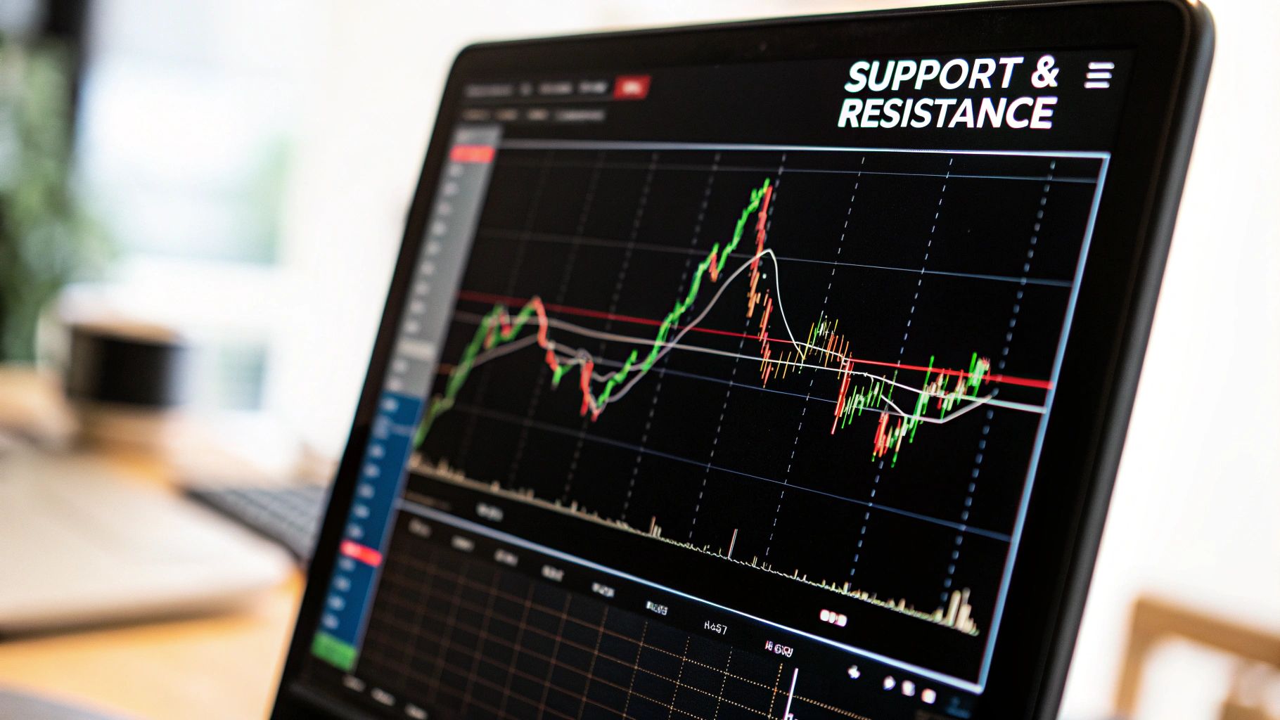
Once I have that directional bias, I drill down to a faster chart, usually a 5-minute, to hunt for a specific setup. The first thing I do is mark the most obvious support and resistance levels. These are the areas where the price has slammed on the brakes and reversed before. Think of them as the battlegrounds.
Let's imagine the market is in a solid uptrend and pulls back to a key support level I’ve marked. I see a bullish candlestick pattern—maybe a Hammer or an Engulfing candle—form right on that support line. That’s my first clue. Then, I immediately glance down at the volume bars. Did that bullish candle pop on a nice spike in volume? Perfect. That’s my confirmation that other big players are stepping in to defend that price.
To really nail my entry timing, I'll check an oscillator like the RSI. If it’s showing a bullish divergence or is starting to climb out of oversold territory, that just adds more weight to my long bias.
This next image simplifies how traders often layer data to confirm a potential move.
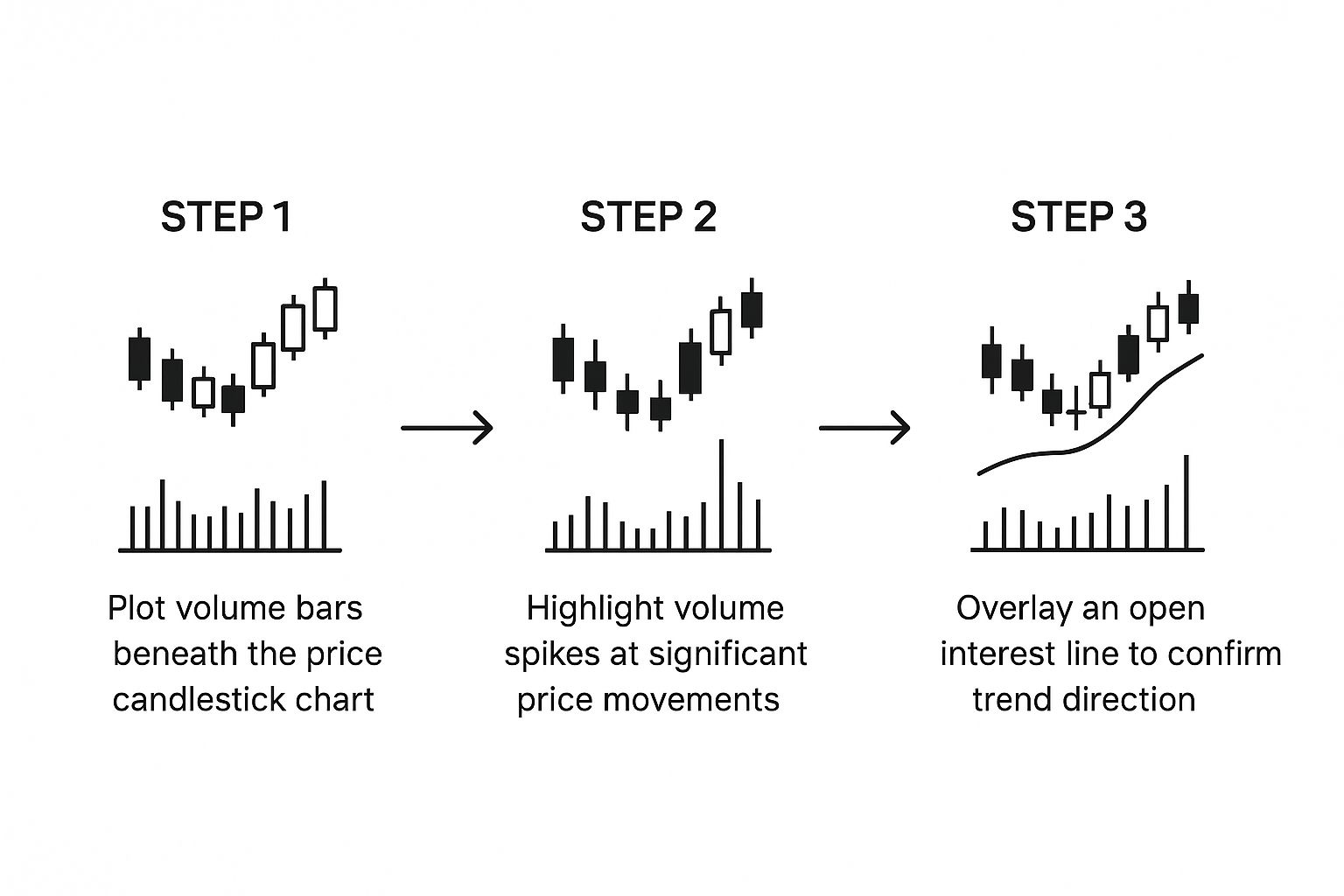
As you can see, combining price action with volume and open interest gives you a much stronger signal than relying on just one of them alone.
Defining Your Risk and Reward
With my entry signal locked in, the next two steps are completely non-negotiable: setting a profit target and a stop-loss. My profit target usually goes just below the next major resistance level. My stop-loss gets tucked right below the low of my bullish entry candle. This gives me a logical plan with a clearly defined risk-to-reward ratio.
This kind of detailed analysis is only possible with quality historical data. Since 1974, specialized data providers have been compiling tick-by-tick data for hundreds of global futures contracts, letting traders like us reconstruct and study charts down to the millisecond. This granular data allows us to backtest strategies and see how markets reacted during major events like the 2008 financial crisis or the 2020 pandemic—which is absolutely vital for building robust trading models.
The goal isn’t to predict the future with 100% certainty. It’s to find setups where the odds are stacked in your favor and then manage your risk relentlessly.
At the end of the day, this methodical approach is what separates consistent traders from gamblers. By learning how to start day trading with a structured plan, you transform chart reading from a guessing game into a repeatable, professional skill.
Common Questions on Reading Futures Charts
When you first dive into futures charts, it's totally normal for a few questions to pop up again and again. Getting a handle on these common sticking points is a huge step toward building the confidence you need to really analyze the markets well. Let's clear up some of the usual suspects.
Probably the first thing I hear from new traders is, "What are the right settings for my charts?" The honest answer? There isn't one. It all comes down to your personal trading goals and how long you plan to be in a trade.
What Is the Best Time Frame to Use for Futures Charts?
The "best" time frame is simply the one that clicks with your trading style. If you're a day trader, getting in and out of the market on the same day, you'll likely live on the 1-minute to 15-minute charts. Your whole game is about catching those quick, small price moves, so you need that granular view.
On the other hand, if you're a swing trader holding positions for a few days or even weeks, those lower time frames are just noise. You’ll find your edge on the 4-hour, daily, or weekly charts where the bigger, dominant trends become clear. Trust me, trading with the major trend is one of the easiest ways to stack the odds in your favor.
My advice is to always use a multi-timeframe analysis. Settle on a primary chart for executing your trades, but always consult a higher time frame to confirm you are trading with the prevailing market current, not fighting against it.
How Should I Interpret Gaps on a Futures Chart?
Gaps are those empty spaces you see when a market opens way higher or lower than where it closed the day before. They're usually caused by some big overnight news or a surprising economic report. At their core, gaps signal a powerful and abrupt shift in how the market feels about an asset.
There's an old trading adage that "gaps tend to get filled," meaning the price often drifts back to close that empty space on the chart. While that's often true, it's what happens when a gap doesn't fill that can be really telling. A gap that holds can create a brand new, very strong level of support or resistance. I usually find it's best to let the initial, emotional dust settle after a gap before jumping into a trade.
Why Are Continuous Contracts Important for Charting?
Individual futures contracts all have expiration dates, which makes long-term trend analysis a real headache. To see how a market has behaved over months or years, you need a continuous contract chart. This is a special chart that digitally "stitches" together individual contracts into a single, seamless price history.
These charts are absolutely critical for backtesting a strategy or applying technical indicators over long stretches of time. Just know that different charting platforms have their own ways of building these continuous charts (like back-adjustment), which can cause slight differences in the historical price data you see.
Mastering futures charts is the first step, but consistent execution is what separates profitable traders from the crowd. Since 2014, Trading Made Easy has been dedicated to bridging that gap. Our patented, AI-driven day trading platform removes emotional decision-making by automatically identifying and managing high-probability trades. We have seen traders transform their results by leveraging technology to enforce discipline and strategy. Ready to trade with more confidence and less stress? Explore our automated software and see how we make trading easier at https://tradingmadeasy.com.
Leave a Reply