
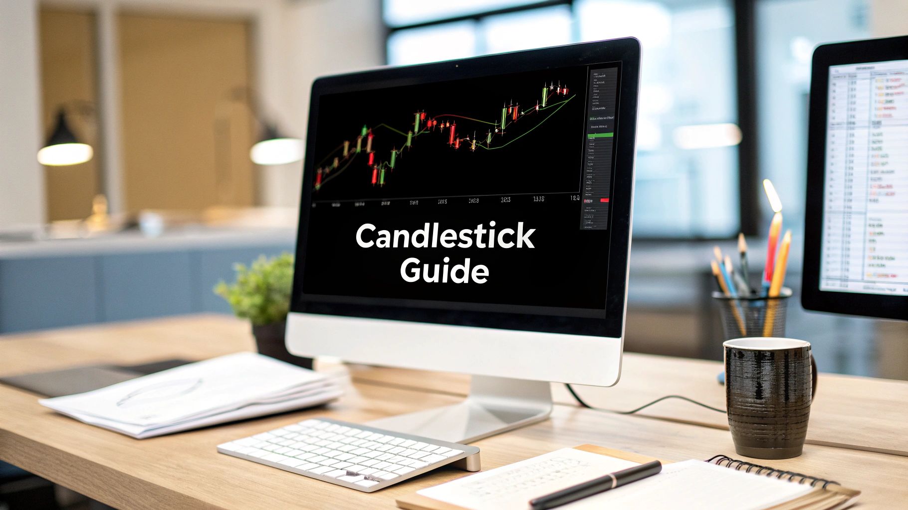
Welcome to Trading Made Easy, where we’ve been helping traders cut through the noise and find clarity in the markets since 2014. Our mission is simple: to make sophisticated trading strategies accessible and actionable for everyone. If you're just starting, think of candlestick patterns as the market's own special language. Each one tells a story, revealing the constant push and pull between buyers and sellers. Learning to read them is your first big step toward understanding what the market is telling you.
Decoding Your First Candlestick Chart
Staring at a candlestick chart for the first time can feel like trying to decipher an ancient code. But trust me, it’s far more intuitive than it looks. Each individual "candle" gives you a powerful, at-a-glance summary of price action, which is why it's a go-to tool for traders everywhere. It’s like a quick snapshot of the market’s mood—is it feeling optimistic (what we call bullish) or pessimistic (bearish)?
This whole idea isn't some newfangled invention. The concept actually dates back to 17th-century Japan, where rice merchants developed it to track and predict price swings. It took a while to catch on in the Western world, but its purpose is exactly the same today: to give you a clear visual of four crucial pieces of price data all at once. If you’re curious, you can learn more about how they evolved by reading up on the history of candlestick charts.
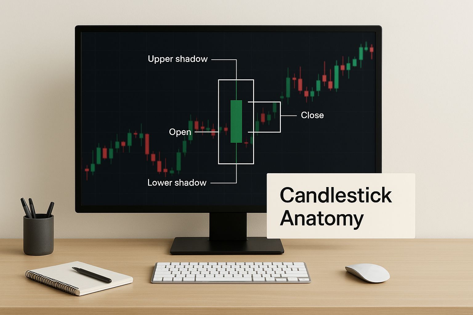
The Anatomy of a Candlestick
To really understand the story a candlestick tells, you just need to know its four basic parts. Each piece gives you a vital clue about the struggle between the buyers (bulls) trying to push prices higher and the sellers (bears) trying to drive them down.
To make this simple, here’s a quick breakdown of what makes up a single candle.
Anatomy of a Candlestick
| Component | What It Represents |
|---|---|
| The Body | This thick, rectangular part shows the range between the open and close price for that specific time period. A long body signals strong pressure, while a short one suggests a quieter, more indecisive market. |
| The Wicks | Also called "shadows," these are the thin lines sticking out from the top and bottom of the body. They pinpoint the absolute highest and lowest prices the asset hit during that time. |
| The Color | The color instantly tells you which way the price moved. A green (or white) candle is bullish—the price closed higher than it opened. A red (or black) candle is bearish—the price closed lower than it opened. |
Once you get a feel for these components, you start to see the bigger picture. Long wicks, for example, often signal major volatility and show that the price was strongly rejected at those high or low levels.
Think of it like this: Each candlestick is a summary of one round in the market's ongoing tug-of-war. The body shows how much ground was gained or lost, the wicks reveal the maximum stretch in either direction, and the color tells you who won that round.
This simple visual language is the bedrock of every candlestick pattern you'll ever learn. Mastering this foundation is the key.
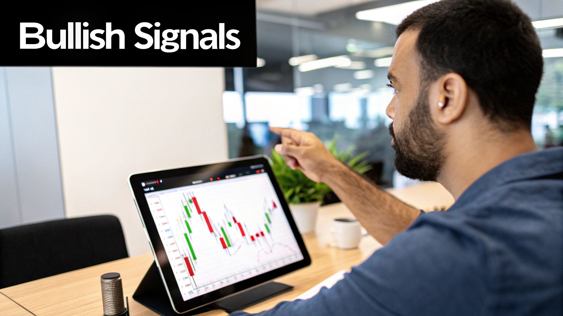
Spotting Bullish Patterns That Signal Opportunity
Once you get the hang of what each individual candle is telling you, you can start to see bigger stories playing out on your chart. For beginners, bullish candlestick patterns are often the most exciting ones to learn. Why? Because they signal a potential comeback story—a moment where the sellers are running out of gas and the buyers are getting ready to step in and take control.
Learning to spot these formations early can give you a huge advantage, helping you pinpoint promising entry points right after a price has been trending down.
These aren't just random shapes on a screen. They're visual proof of a battle between buyers and sellers where the bulls won. Getting a feel for the psychology behind them is what really turns these patterns from abstract concepts into actionable trading ideas. Let's dig into a few of the most common bullish patterns you'll see out in the wild.
This image breaks down the anatomy of a candlestick, which is the foundation for every single pattern we're about to cover.
Seeing how the body and wicks work together makes it much clearer how a candle tells the story of market sentiment over a specific period.
The Hammer And Inverted Hammer
Picture this: an asset's price has been steadily dropping. Then, out of nowhere, a candle appears with a tiny body at the very top and a long shadow stretching down below it. That's a Hammer, and it tells a powerful story.
Sellers gave it their all, trying to hammer the price down, but buyers came storming back with so much force that they drove the price all the way back up to close near where it opened.
A Hammer's long lower wick—which should be at least twice the size of the body—is a huge sign of rejection from those lower prices. It’s a classic signal that a bottom might be in place and a bullish reversal could be just around the corner.
The Inverted Hammer is exactly what it sounds like—a Hammer flipped upside down. It also shows up during a downtrend, but this one has a long upper wick and a small body at the bottom. The story here is a bit different. Buyers made a valiant effort to push the price up, but sellers managed to knock it back down. Still, the fact that buyers showed that much muscle after a long downtrend is a bullish sign. It hints that the sellers are losing their grip.
The Bullish Engulfing Pattern
Of all the reversal signals, the Bullish Engulfing pattern is one of the most direct and powerful. It’s a two-candle pattern:
- First, you have a smaller bearish (red) candle that's part of the existing downtrend.
- Next, a larger bullish (green) candle forms that completely "engulfs" the entire body of the previous red candle.
This pattern signals a massive and decisive shift in who's in control of the market. The sellers were in the driver's seat on day one. But on day two, the buyers showed up with overwhelming power. They not only erased all of the previous day's losses but also managed to close much higher.
This engulfing action is a clear sign that bullish momentum has completely taken over, often marking a very strong reversal point. When you see this pattern form on high trading volume, its predictive power gets even stronger.
These patterns are your first clues for spotting potential turnarounds in the market. By learning to read their stories, you’re no longer just looking at lines on a screen—you're starting to understand the real-time tug-of-war between supply and demand.
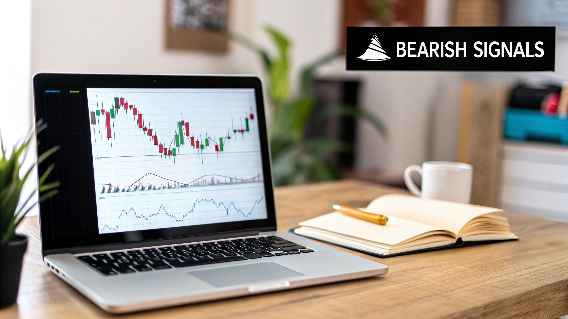
Recognizing Bearish Patterns That Signal Caution
It’s one thing to get excited about a rally, but real trading skill comes from knowing when to pump the brakes. Bearish candlestick patterns are the market’s warning flares, telling a story of worn-out buyers and a potential power shift over to the sellers. Spotting these formations is absolutely critical if you want to manage risk and protect your hard-earned capital.
Think of it this way: just as a bullish pattern shows buyers taking charge, a bearish pattern reveals the moment sellers swamped the competition. Learning to read these signals helps you see when a strong upward trend might be running out of gas.
The Shooting Star and Hanging Man
The Shooting Star is a classic sign of trouble that pops up at the peak of an uptrend. It has a tiny body at the bottom and a long upper wick, painting a clear picture of the market rejecting higher prices. Buyers gave it a good shot, pushing to new highs, but sellers smacked the price right back down. It’s a strong hint that the bulls are losing their grip.
Its cousin, the Hanging Man, looks exactly the same but shows up after a sustained uptrend. It features a small body at the top with a long lower wick. This suggests that even though the price closed near its high, a major sell-off happened during the day before buyers could muster a weak recovery. This candle is a red flag that selling pressure is quietly building.
The Bearish Engulfing Pattern
The Bearish Engulfing pattern is probably the most dramatic "watch out!" signal you can get. It's a powerful two-candle formation that tells a story of a sudden and brutal shift in market mood.
- First, you see a standard green (bullish) candle during an ongoing uptrend.
- The very next candle is a huge red (bearish) one that completely swallows the body of the previous green candle.
This isn’t just sellers stopping the buyers in their tracks; it’s them completely overwhelming the bulls, wiping out all of the previous day’s gains and then some. It’s an unmistakable visual cue that the bears have taken over and a downtrend could be right around the corner. Many beginners learn this pattern first because its message is so direct. For those just starting out, understanding these basics is a huge first step, and you can learn more about how to start day trading in our complete guide.
A Bearish Engulfing pattern is like a sudden plot twist in a movie. Just when you think the hero (the bulls) will keep winning, the villain (the bears) shows up with overwhelming force, completely flipping the script and setting up a new story.
Of course, no single pattern is a crystal ball. But their predictive power gets a lot better when you know how to interpret them in context. For example, a study looking at S&P 500 data found that the Shooting Star was a much more reliable forecast when traders paid attention to its high price, not just the close. Little details like that show why a deeper understanding is key to really using candlestick patterns for beginners effectively.
Understanding When a Trend Is Pausing, Not Reversing
After you learn to spot powerful reversal patterns, it's tempting to see every little stutter in the market as a sign that the trend is about to turn on a dime. But here’s a skill that separates seasoned pros from beginners: telling the difference between a real reversal and a simple consolidation.
Not every slowdown means the party's over. Sometimes, the market is just catching its breath.
This is where continuation patterns come into the picture. These are candlestick shapes that signal a trend is likely to fire back up in its original direction after a brief timeout. Learning to recognize them will stop you from making one of the most common mistakes: bailing on a great trade way too early.
Doji and Spinning Tops: Moments of Indecision
The most frequent signs of a market taking a breather are the Doji and the Spinning Top. While they can sometimes show up in reversal setups, they often just signal plain old market indecision. A Doji is a really unique candle where the open and close price are almost identical, which gives it that classic cross shape.
A Spinning Top is similar, but it has a tiny body with long wicks sticking out of the top and bottom. Both of these candles are telling you the same story: neither the buyers nor the sellers could get the upper hand during that session. It was a draw—a temporary stalemate in the ongoing tug-of-war for control.
Think of a Doji or a Spinning Top like someone hitting the pause button. The action hasn't stopped for good, but both sides are regrouping before the next big shove. Your job is to wait and see which way the market breaks after this pause.
Learning to see these candles as moments of consolidation is huge. In a strong uptrend, one little Spinning Top doesn't automatically mean a crash is coming. More often than not, it's just a sign that buyers are taking a quick break before pushing prices even higher.
What These Pauses Really Mean
Understanding the difference between a pause and a reversal is what builds the patience you need to be a successful trader. Here’s what these continuation signals are really telling you:
- Temporary Equilibrium: A Doji shows that supply and demand have found a brief moment of balance. The market is just digesting its recent move before it gets going again.
- Reduced Momentum: A Spinning Top tells you the powerful momentum from the last few candles has cooled off, but it doesn't mean the trend is dead. It’s a moment of indecision, not defeat.
- Confirmation is Key: This is critical. Never, ever act on a Doji or Spinning Top by itself. The candle that forms after the indecision candle is what gives you the real clue. If a big, strong bullish candle follows a Spinning Top in an uptrend, that confirms the trend is still very much alive.
By learning to spot these moments of consolidation, you add a much-needed layer of nuance to your chart reading. This skill helps you stay in strong trends longer and stops you from getting shaken out by minor market noise, which is a vital part of mastering candlestick patterns for beginners.
Putting It All Together with Trading Made Easy
Knowing how to read candlestick patterns is a fantastic starting point. But let’s be honest—in the heat of the moment, when the market is moving and your money is on the line, it’s all too easy to freeze up. Hesitation, second-guessing, and raw emotion can turn a perfect setup into a missed opportunity or a bad trade. This is where theory crashes into reality, and it's the gap we’ve been helping traders cross since 2014. At Trading Made Easy, our mission is to empower traders by removing these emotional barriers.
Key Features: How Our Software Gives You an Edge
We designed our patented, automated day trading software to execute strategies with precision and discipline. It spots high-probability candlestick setups—like the Hammer or Engulfing patterns—in real-time and acts on them without emotional interference. Key features include:
- Automated Pattern Recognition: It identifies the best setups so you don't have to watch the charts all day.
- Emotional Discipline: Trades are based on logic, not fear or greed, which helps maintain consistency.
- Built-in Risk Management: Every trade automatically includes a stop-loss and profit target to protect your capital.
This system takes the proven logic of technical analysis and puts it to work for you, helping you trade more systematically.
Success Stories: Real People, Real Results
This isn't just theory; it's a game-changer for traders struggling with inconsistency. Take Mark, one of our clients who knew his patterns but was crippled by second-guessing. After implementing our software, he saw his account grow steadily because trades were executed based on disciplined strategy, not fleeting emotions. Mark’s story is a testament to what happens when you combine solid knowledge with automated, logical execution.
Frequently Asked Questions About Candlestick Patterns
As you dive into the world of trading, it’s completely normal to have questions. This FAQ is here to tackle some of the most common things beginners wonder about when it comes to candlestick patterns, giving you straight answers so you can build your confidence.
How Reliable Are Candlestick Patterns?
Think of candlestick patterns as strong hints, not unbreakable promises. Their reliability really skyrockets when you use them with other signals. It's a lot like a weather forecast—one dark cloud doesn’t guarantee rain. But when you see dark clouds, feel the temperature drop, and the wind picks up? A downpour is probably on its way.
It’s the same in trading. A bullish hammer pattern is a good sign, but it becomes a much more credible signal if it appears right at a major support level while trading volume spikes. No single pattern is 100% accurate, which is why they should always be just one part of a solid trading plan that includes smart risk management.
Getting a handle on these basics is your first big step. If you're looking for a clear roadmap, our guide on how to start day trading can help you put all the pieces together.
Which Timeframe Is Best for Trading Patterns?
Candlestick patterns show up on every timeframe imaginable, from a one-minute chart to a monthly one. The “best” timeframe really just comes down to your personal trading style and what you’re trying to accomplish.
- Day Traders usually stick to shorter timeframes, like 5-minute or 15-minute charts, to spot and act on quick moves throughout the day.
- Swing Traders might lean on 4-hour or daily charts to catch bigger price swings that play out over several days or even weeks.
The most important thing is to be consistent. A pattern’s importance is always relative to the achart you’re watching. For instance, a bullish engulfing pattern on a daily chart points to a much more significant shift in market sentiment than the same pattern popping up on a 1-minute chart.
Can I Trade Using Only Candlestick Patterns?
While you technically could, trading with nothing but candlestick patterns is something I’d strongly advise against, especially for beginners. It's like trying to drive a car by only looking at the speedometer—you're missing a ton of critical information about what’s happening on the road ahead.
Successful traders combine pattern analysis with other tools to confirm signals and filter out market noise. Context is what transforms a simple shape on a chart into a high-probability trading setup.
This means layering in other technical tools. Look at moving averages, check the Relative Strength Index (RSI), and pay attention to trading volume. This multi-layered approach helps confirm the story the candlesticks are trying to tell you, leading to smarter, more confident decisions.
You've just learned the essential candlestick patterns for beginners—a crucial first step in your trading journey. By combining this knowledge with smart tools and disciplined strategy, you can navigate the markets with greater confidence. At Trading Made Easy, we’ve built our automated software to handle the execution, taking the guesswork and emotional stress out of the equation. Explore how our system can help you trade with precision by visiting us at https://tradingmadeasy.com.
Leave a Reply